Although online marketing is vitally important and effective within the digital age, promoting our company through print such as: brochures, posters and leaflets are still a necessity. This format ensures that the piece reaches members of the public of all age ranges and also ensures that JumpCut stands out against the vast amount of theatre companies online by focusing on the local market audience.
Brochure/ Show copy-
The starting image that I created for the company was comprised of four selfies of us applying make-up. I then edited the images and added filters as this fitted with our beginning ideas surrounding the creation of highlighting the reflective differences between on/offline identities. The image below (bottom right) appeared in the brochure for the Lincoln Performing Arts Centre the venue where all seven of the theatre company performances were taking place.
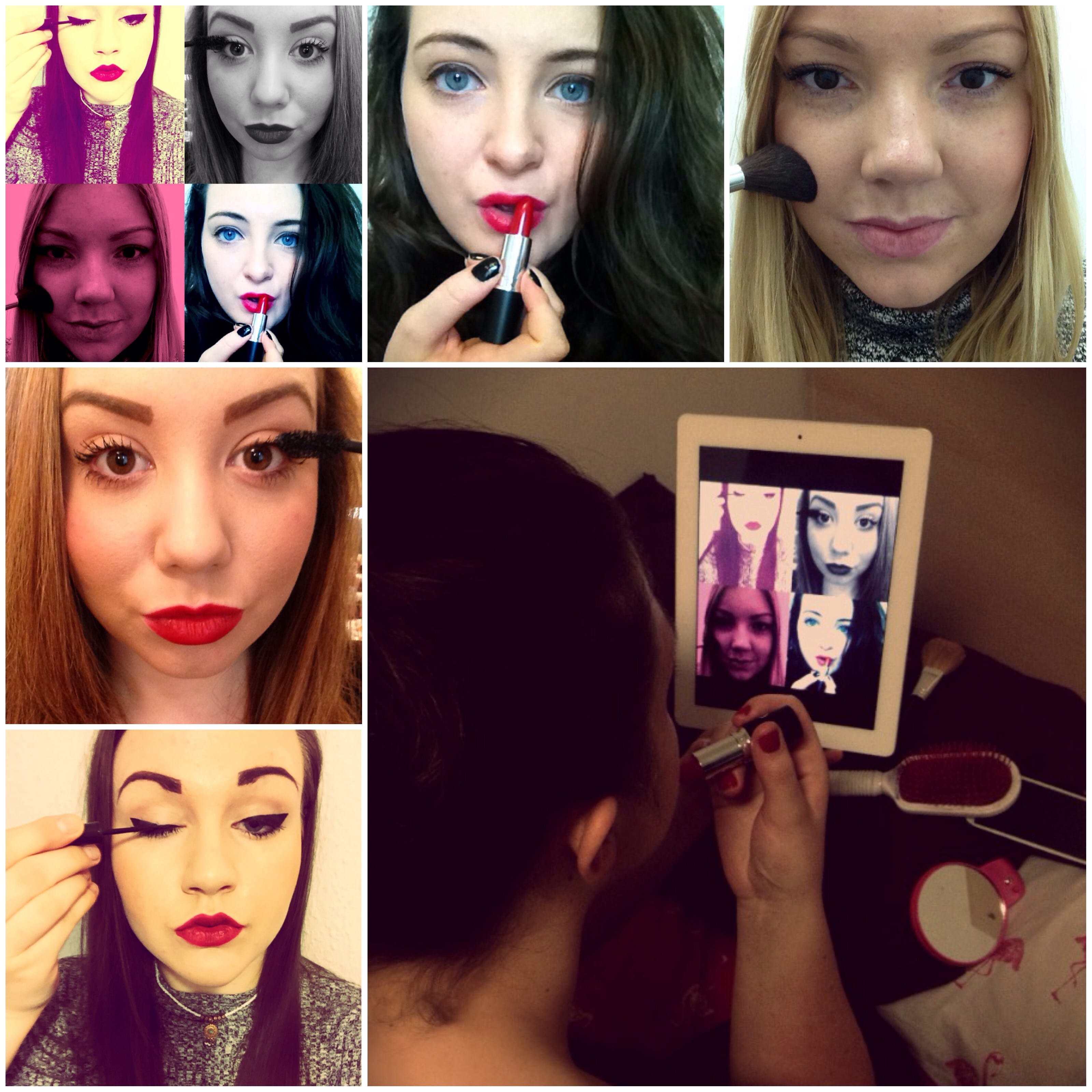
The image above also shows the original pictures before editing to highlight the use of filters during the making of the promotional image. The final image was accompanied by our write-up for the performance which provided information and hopefully enticed people to come and see the show:
Choose a username, apply make-up, contort your body, find the perfect lighting and pout in order to take the perfect selfie for your online profile. Which of the 47 selfies are you going to choose? It’s an important and meticulous selection process since users worldwide will be able to access your profile. Through the exploration of online and offline identities, we take you on a journey into creating the perfect online profile.
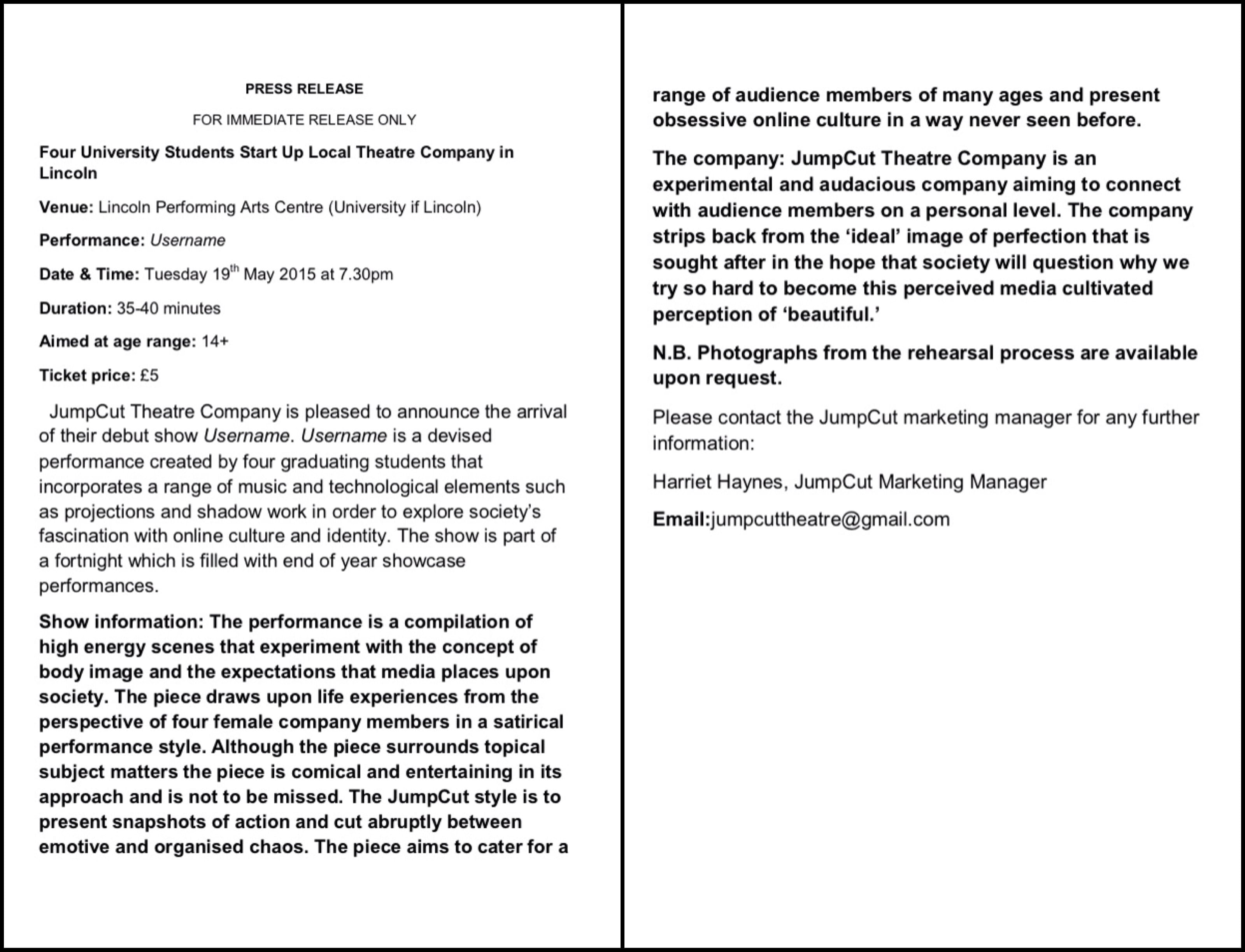
Press Release:
Poster-
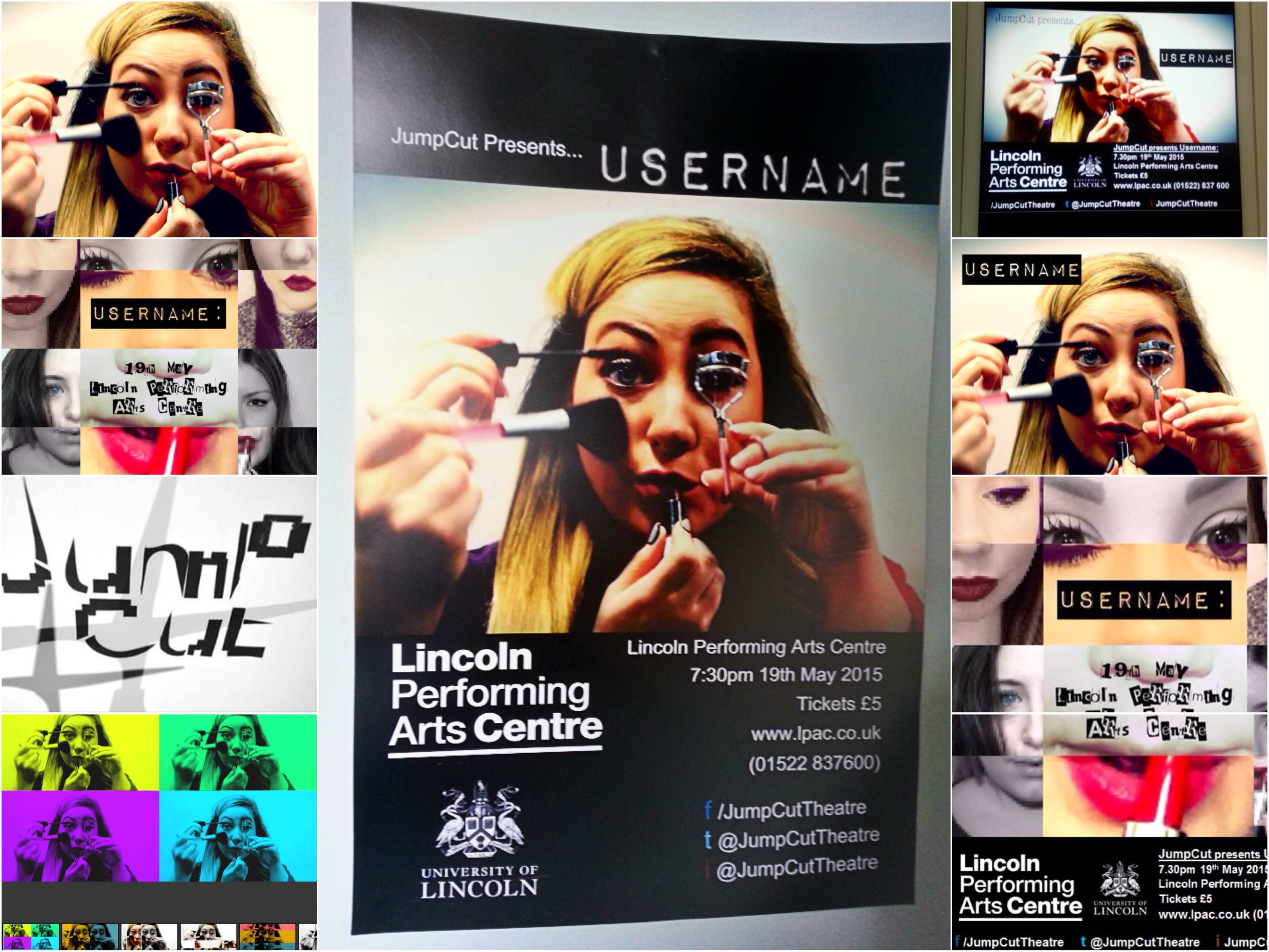
Throughout the rehearsal process we began to focus on snapshots of scenes and jump cutting between the action rather than having a linear narrative. This style influenced the promotional image I originally created (bottom right) of jumbled head shots and the use of filters to reflect how people rely heavily on using filters through social media.
I then developed the final poster design (central) which was A3 in size. After filming the promotional video I decided to present a more defined eye-catching image of an individual applying make-up rather than intersections as this image is more direct in its approach. The final poster image still portrays the entire ensemble of JumpCut as it is a merge of all four faces of JumpCut Theatre Company. The poster image is bordered in striking monochrome to stand out from other poster designs that local theatre companies have created. It also fitted well with the JumpCut logo’s colour scheme (pictured on the left) and this editing process helped JumpCut to establish an artistic style which I wanted to resonate throughout the marketing resources that I created.
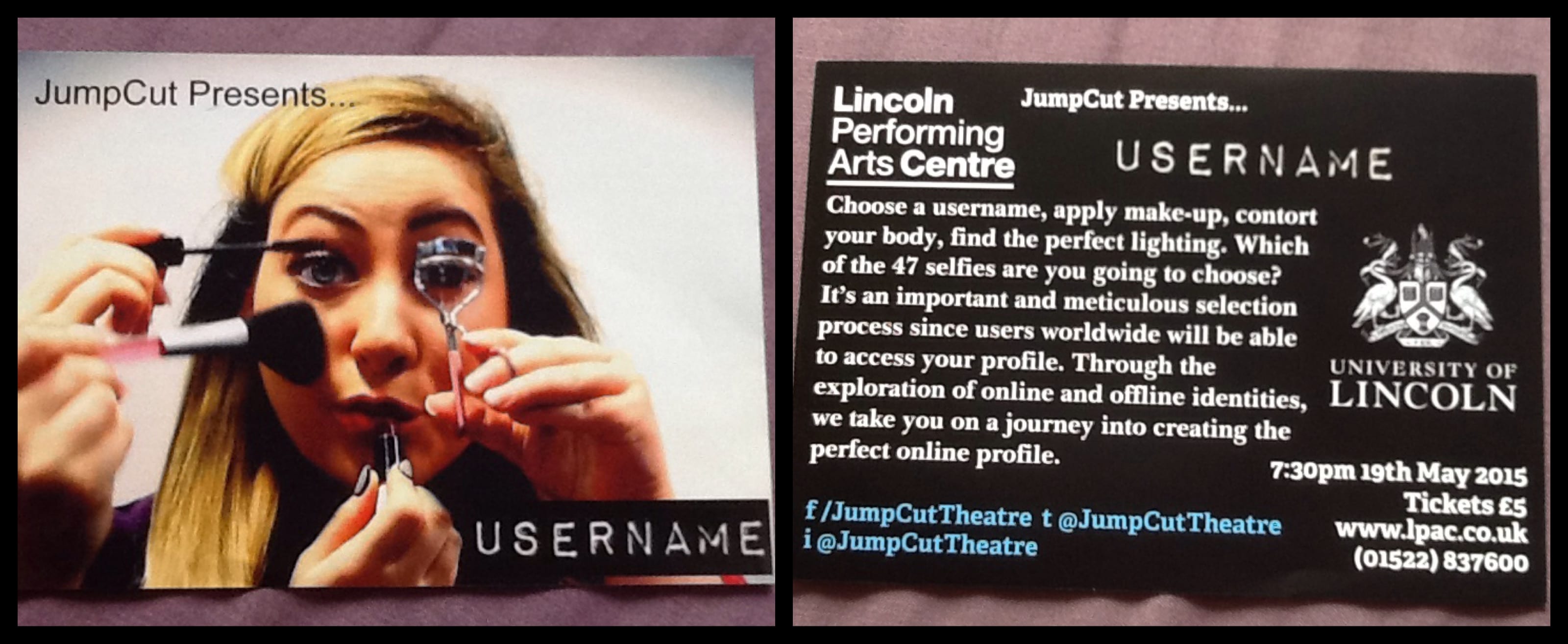
Leaflet-
The leaflet also ties in with the artistic style incorporating a monochrome colour scheme with splashes of vibrant colour and the use of a head shot image. The leaflet is A5 in size and provided a synopsis on the reverse making it accessible for people to take away and discover more about JumpCut’s performance ‘Username.’
The posters and leaflets were distributed around the university campus with a major focus on the Lincoln Performance Arts Centre as this was the venue for the performance. They were also distributed within the local town centre and business buildings to widen the publicity of the performance and draw in a range of audience members as the performance caters for the majority of social media users.
Work Cited:
Haynes, H (2015) Brochure Image. Taken 20/03/15
Haynes, H (2015) JumpCut Leaflet Design. Taken 20/05/15.
Haynes, H (2015) JumpCut Poster. Taken 20/05/15.
Haynes H (2015) Press Release. Taken 20/05/15.